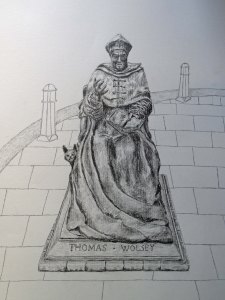
Statue of Cardinal Wolsey, St Peter’s Street, Ipswich (pencil)
Final version (post tutor report) with the lines of the paving stones adjusted to improve the linear perspective
Thoma Wolsey statue
While sketching in St Peter’s Street for the ‘Study of a townscape using line’ I noticed a wonderful statue of Thomas Wolsey and just before the rain came down in buckets I managed a good look and got some photographs, which I used to draw from at home.
The statue, by David Annand, was unveiled in 2011 and although I’ve passed by it before, this was the first time I’d stopped to take a really good look. It is a bronze and has a variety of semi-rough textures. It is situated very close to where Cardinal Wolsey, who was Henry VIII’s Lord Chancellor and a very powerful statesman until he fell from grace, lived.
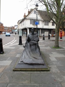
Photograph of David Annand’s Thomas Wolsey Statue
My attention was particularly caught by the pose; Wolsey is sitting back in a chair with long flowing robes spread out in front of him. This means that when looking straight on, he is sitting some way back. I particularly liked the ruffled texture of the sleeves.
Wolsey used to have his cat at his side when he was presiding over judicial proceedings.
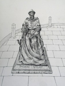
In my initial sketch I got proportions wrong; Wolsey’s body was too long which meant the impact of the long robes was lost. I’ve not shown the sketch here because I rubbed most of it out immediately before deciding to start again using a bigger, A2, sheet.
It was a very grey, overcast day with just a glimmer of light coming from the left. I decided to include the bollards and paving as an indication of place and context but kept the background very simple as a contrast to the more detailed statue. I used a lightly textured cartridge paper, which leaves some weave marks and seems to suit the quite ‘rough hewn’ nature of the statue.
I was having trouble with drawing the hand from the photo as I just couldn’t get it to look right, so I photographed my own (not an easy thing to do at that angle) and worked from the photo with more success.
While my drawing has faults, I am pleased with it. The plinth should have extended back a little further and, overall, the statue is very slightly thinner and the robes do not billow out quite so much, but this has not detracted much from the overall impression.
I decided to leave out the cigarette butts discarded around the plinth – in a larger study I think I would have include them because they say something about how different relationships are with statues when they are out on the street rather than inside museums or galleries. There was puddle of dirty water in the robes at the front. I tried to capture it but it looks like a shadow.
I am quite encouraged by this drawing, and reminded how nice pencils are to work with and what a handy thing a putty rubber is for creating highlights.
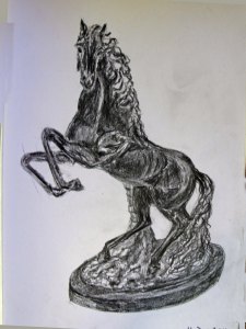
Horse statue
Karen’s horse statue
I hadn’t planned to draw another statue but while drinking tea at my friend Karen’s I spotted a statue of a rearing horse in the corner of her dining room. It was made of matt black resin and the darker indented areas had been highlighted in white, just to confuse me. It was lit from the back so the combination made it quite difficult to pick out the light and shadows. But it was a good exercise and fun to draw in my sketch book. I used B and 2B pencils.
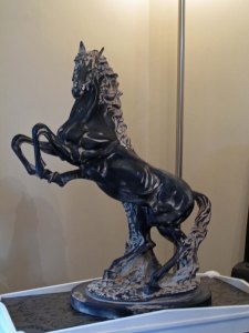
Photo of horse statue
In my drawing the top back leg is a little low and a little long. I seem to have shortened the horse’s back, perhaps in response to it appearing too long in the statue itself (see photo).


